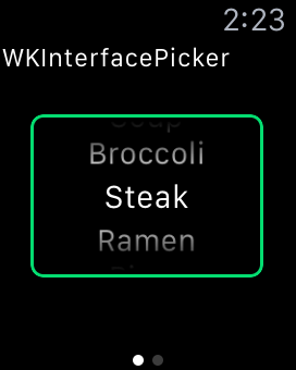
Apple has provided a new WKInterfaceObject called WKInterfacePicker. It allows you to select an item from a list, similar to the UIPickerView you're already familiar with in iOS 8. You can use it on a list of text, images, and the items are selected by using the Digital Crown.
Picker Styles
There are three main styles you can choose from: List, Stack and Sequence.
The List style is very similar the the UIPickerView in iOS, where you use the crown to select a sequential list of items. The items can be images and text, just text or just images.
The Stack Style animates the items like a stack of cards, providing an attractive way to select an item.
The Sequence Style replaces each image, allowing you to quickly flip between your choices, and also can be used to animate progress bars.
Focus Styles
For each style, you can indicate a focus style, which indicates how you want watchOS to display which picker is in focus. If there is only one picker on the screen, you may want to use None. If you have multiple pickers, you need to indicate which control is in focus and will be affected by the Digital Crown. For example, when customizing the clock face, Outline focus styles are used to indicate which complication is in focus to be adjusted by the Digital Crown.
Each picker item can be annotated by a caption, which can be used to indicate the group or secondary information about the item that will be displayed while picking. The caption can be useful if you are picking images, for example.
Focus Style: None
Focus Style: Outline
Focus Style: Outline With Caption
Coding
Open the Storyboard for your WatchKit App, and drag a Picker into your InterfaceController.
Choose the Style and Focus Style. The Indicator allows you to toggle whether the scroll guide appears beside the Digital Crown. This can be useful for styles like Stack, where it may not be clear to the user where in the list they have scrolled to.
Connect your picker to your interface controller twice, one for the outlet and one for the action.
class InterfaceController: WKInterfaceController {
    @IBOutlet var itemPicker: WKInterfacePicker!

    @IBAction func pickerSelectedItemChanged(value: Int) {
    }
}
We're going to use the IBOutlet to set up the picker with initial values, and the IBAction to react to changes in the picker.
Here's the code for a picker populated with some text:
class ListPickerInterfaceController: WKInterfaceController {
    @IBOutlet var itemPicker: WKInterfacePicker!

    var foodList: [(String, String)] = [
        ("Broccoli", "Gross"),
        ("Brussel Sprouts", "Gross"),
        ("Soup", "Delicious"),
        ("Steak", "Delicious"),
        ("Ramen", "Delicious"),
        ("Pizza", "Delicious") ]

    override func willActivate() {
        super.willActivate()

        let pickerItems: [WKPickerItem] = foodList.map {
            let pickerItem = WKPickerItem()
            pickerItem.title = $0.0
            pickerItem.caption = $0.1
            return pickerItem
        }
        itemPicker.setItems(pickerItems)
    }

    @IBAction func pickerSelectedItemChanged(value: Int) {
        NSLog("List Picker: \(foodList[value].0) selected")
    }
}
Modifying this to support images like in the Stack picker is very simple. Just use the new WKImage and pass those in. If you wanted to create a picker with images frame1.png to frame5.png:
class StackPickerInterfaceController : WKInterfaceController {
    @IBOutlet var itemPicker: WKInterfacePicker!

    var items: [String]! = nil

    override func willActivate() {
        super.willActivate()

        items = (1...5).map { "frame\($0).png" }

        let pickerItems: [WKPickerItem] = items.map {
            let pickerItem = WKPickerItem()
            pickerItem.contentImage = WKImage(imageName: $0)
            return pickerItem
        }
        itemPicker.setItems(pickerItems)
        itemPicker.focusForCrownInput()
    }

    @IBAction func pickerSelectedItemChanged(value: Int) {
        NSLog("Stack Picker: \(items[value]) selected.")
    }
}
Finally, you'll find that a Sequence picker is set up exactly like the Stack picker:
class SequencePickerInterfaceController : WKInterfaceController {
    @IBOutlet var itemPicker: WKInterfacePicker!

    override func willActivate() {
        super.willActivate()

        let pickerItems: [WKPickerItem] = (0...100).map {
            let pickerItem = WKPickerItem()
            pickerItem.contentImage = WKImage(imageName: "picker\($0).png")
            return pickerItem
        }
        itemPicker.setItems(pickerItems)
    }

    @IBAction func pickerSelectedItemChanged(value: Int) {
        NSLog("Sequence Picker: \(value) selected.")
    }
}
Wrapping Up
All of the sample code for this project is available in the Sneaky Crab GitHub. If you're having trouble, make sure to download it and try out the sample code.
WKInterfacePicker provides a simple way to do very attractive and easy to use picking using the Digital Crown in watchOS 2.
What cool interactions have you designed for your watch apps?


